

Total Time heatmap
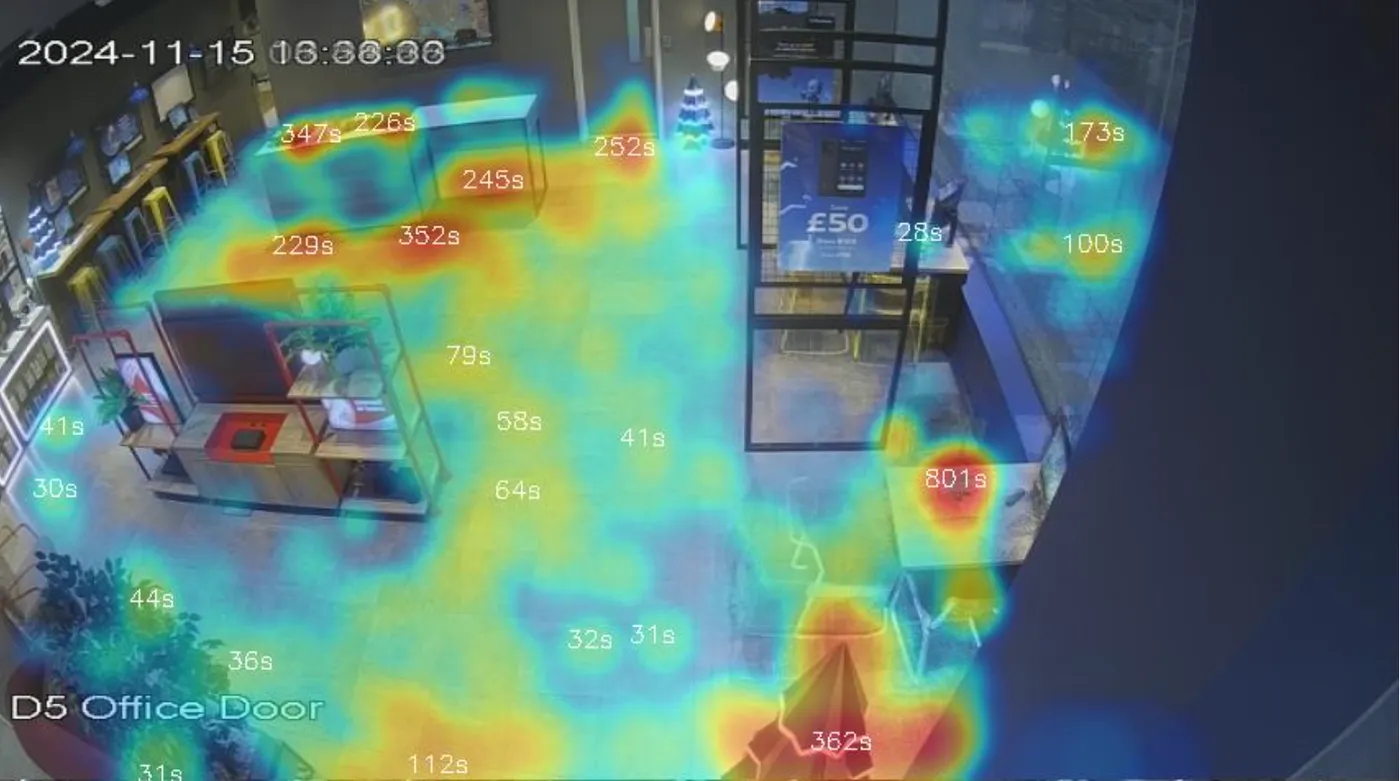
A Total Time heatmap shows where customers spend time across the store. Red areas indicate the longest cumulative dwell; cool areas indicate quick passes or empty floor.
A Total Time heatmap shows where customers spend time across the store. Red areas indicate the longest cumulative dwell; cool blue areas indicate quick passes or empty floor.
How it’s plotted
Aura Vision aggregates the time every customer spent at each point on the floor over the period you select (a day, a week, a month). Only dwell longer than 5 seconds is counted, which filters out shoppers cutting straight through. The result is a smooth overlay on the camera view’s floor plan.
What it’s useful for
- Spot real engagement vs. assumed engagement. The hottest spots are often not where merchandising teams expect — natural pinch-points (entrance, till queue, fitting rooms) compete with display-driven dwell.
- Before-and-after comparisons. Run one heatmap before a layout change and one after to see whether dwell genuinely shifted to the new display.
- Underperforming zones. Cool spots near merchandise you want shoppers to engage with point at discoverability or sightline issues — not necessarily product or price.
How it differs from a Popular Path heatmap
- Total Time answers “where do customers spend their time?” — weighted by dwell.
- Popular Path answers “where do customers walk?” — weighted by movement.
Use Total Time for engagement and merchandising decisions; use Popular Path for layout, signage and circulation.